Sorry, your cart is empty :(
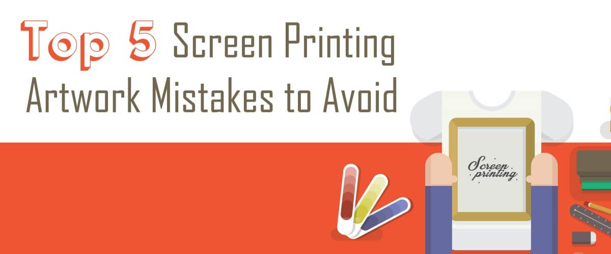
1. Using Low-Quality Art Files
If you start with a low-quality art file – one that is low resolution, too small or in the wrong file format for the job – you will end up with subpar artwork. There’s no way around this, short of recreating the design from scratch. While the standards for artwork within your shop might be high, the difficulty comes in accepting artwork from clients. When clients are submitting artwork, the temptation is to work with what they give you for the sake of being accommodating. By not maintaining your standards for the artwork you accept from customers, you ultimately do your customers a disservice. Make clear the guidelines for providing artwork to your shop, and hold customers to those guidelines. In the end, they’ll thank you for providing them with a high-quality finished product.
2. Not Using the Pantone Matching System
There’s a reason the Pantone Matching System is the gold standard, and it’s the best way to ensure that you get the colors you’re looking for in your shop. Because no two computer monitors represent colors in the same way, it’s impossible to know if you’re getting the color your customer wants, or the color that you want, without a Pantone book. Use the system internally to get the ink colors you want, and have customers who require more precise colors provide you with the Pantone Matching System color codes they want in their final prints.
3. Not Performing Quality Checks
If there’s a mistake in your artwork, the best place to catch it is before it’s transferred onto screens. Even on your busiest days, make sure you’re performing quality checks of your artwork every time. Double check the densities and transparencies of your colors, the halftone specifics, trapping, gradient overlaps and dot-gain compensations. The more complicated the artwork, the more in-depth your checks should be. The few minutes it takes you to check your artwork can save you a lot of time and work if you catch a mistake before it makes it to the screens or the press.
4. Insisting on Doing Everything In-House
You, or your art department, might be perfectly capable of preparing any artwork that comes their way. Or, you might be able to get by with most things that come their way. Regardless of your art-preparation capabilities, it’s wise to have a back-up resource for your art department. Having a contractor or company on file to call if your art department gets overwhelmed with an influx of time-consuming separations or if an extremely complicated separation comes your way can help you accommodate any client. You never want to have to turn a job away because your art department is overwhelmed or can’t handle the preparations.
5. Not Honing Your Art Skills
Because the artwork process used in screen printing is predominantly digital, there are constant updates and innovations. You have to take the time to keep up with industry changes. Read trade publications and websites, check out online tutorials, attend trainings or — especially if you’re self-trained and could afford to upgrade your skills — consider taking a course on using artwork programs and creating separations, either at a local college or online.
The bottom line in screen printing is that you need great artwork to create great prints. You can improve the quality of your finished products, and avoid misprints, by avoiding common artwork mistakes.
Looking for some other ways to control the quality of your screen printed products? Check out these blog posts:
Screen Printing Quality Control: Stop Problems Before They Start
How to Give Your Screen Printing Customers the Total Quality Experience
How to Avoid Screen Printing Misprints (and How to Reuse Them When They Happen Anyway)
Recent Articles

In screen printing, few factors influence print quality and production speed as much as screen tension. High, consistent mesh tension ensures fast snap-off, clean ink release, sharp details, and smooth flooding. Low tension, on the other hand, slows production, causes smearing, uneven ink deposits, and leads to rapid stencil and mesh wear.
December 2 2025
Read more
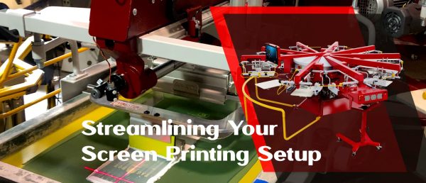
Optimize your screen printing darkroom with Anatol’s VOLT press and automatic coating machines. Learn screen reclamation best practices, determine the right number of screens, and boost efficiency. Streamline your setup to enhance print quality, reduce costs, and handle high-volume jobs effectively. Revolutionize your shop today!
November 21 2025
Read more
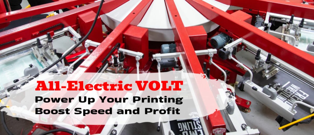
VOLT by Anatol — Supercharge Your Screen Printing, Save Time and Money.
Take back your time, cut your costs, and leave pneumatic problems behind for good.
November 17 2025
Read more

With Section 179 of the IRS tax code, you can deduct the total cost of qualified equipment you buy in 2025, up to $3,130,000 in total purchases. You can also take advantage of 40% bonus depreciation on both new and used equipment purchased in 2025. Act now before the year ends.
October 21 2025
Read more

Flashing is a critical step in the screen printing process, especially when working with multi-color designs or specialty inks. It refers to the process of briefly curing the ink between print strokes using a flash dryer.
October 1 2025
Read more
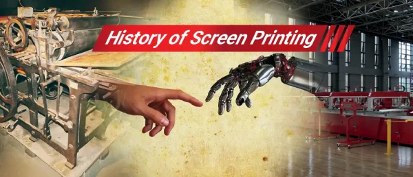
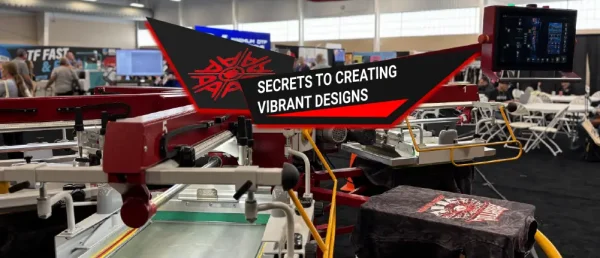
Screen printing, from ancient Chinese stencils to modern automated systems, blends tradition with innovation, creating vibrant, durable designs on various surfaces
September 29 2025
Read more
High density printing is a unique screen printing technique that creates bold, raised, and vibrant designs with a premium look. By applying thick layers of ink, it delivers long-lasting colors, tactile appeal, and eye-catching graphics. Discover how this method helps brands and designers produce unforgettable apparel with maximum visual impact.
September 19 2025
Read more
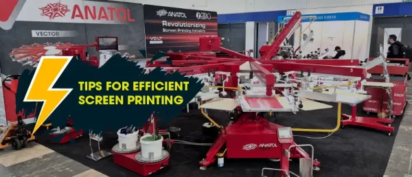
Discover how to boost your screen printing speed without sacrificing quality. From choosing the right equipment and inks to streamlining setup, curing, and team training, these practical tips help you achieve faster turnaround times while keeping prints sharp and professional.
September 9 2025
Read more
